Outdoor advertising, particularly billboard marketing, is a cornerstone of Kenya’s vibrant advertising ecosystem. With urban centers like Nairobi, Mombasa, and Kisumu buzzing with life, billboards present a golden opportunity for brands to capture attention and make lasting impressions. However, the potential of Kenya billboard advertising can be easily squandered by common design mistakes that not only frustrate viewers but also undermine brand visibility. In this article, we’ll explore ten key billboard design mistakes you should avoid, providing actionable insights to help your brand thrive in Kenya’s competitive marketing landscape.
Understanding the Importance of Billboard Design
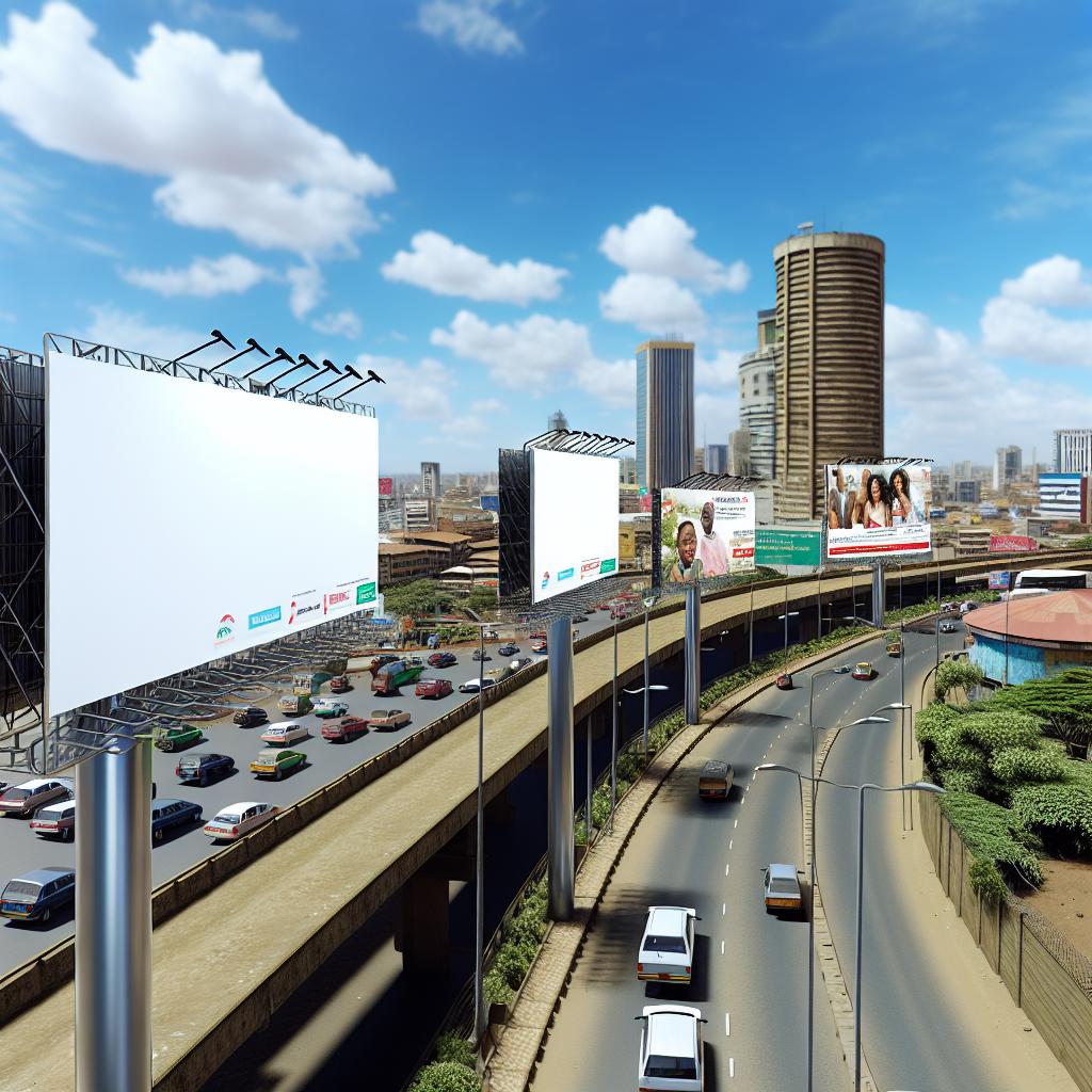
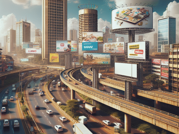
Before diving into the specific mistakes, it’s essential to grasp the significance of effective billboard design. Billboards are not just large canvases for messages; they are vital tools for brand visibility. In cities like Nairobi, where traffic congestion is heavy and pedestrian movement is constant, a well-designed billboard can captivate eyes within seconds.
The Dynamics of Outdoor Marketing in Kenya
Kenya’s advertising trends show that businesses are increasingly leaning towards outdoor marketing as a primary strategy. This shift is driven by the growing population and the rise of digital advertising Kenya. However, with competition intensifying, it’s crucial to ensure your billboard stands out for the right reasons. Let’s explore some common pitfalls.
Mistake #1: Overcrowding with Information
Less is More
One of the most frequent billboard design mistakes is overcrowding the space with too much information. Given the limited time viewers have to read your message—typically just a few seconds—clarity is key. For instance, a billboard in downtown Nairobi advertising a new restaurant with lengthy descriptions and small font sizes will likely be ignored.
Tip: Aim for a simple, concise message. Use no more than five words to convey your core idea. For example, “Delicious Meals at Gikambura Road” is much clearer and more impactful than a lengthy elaboration.
Mistake #2: Poor Font Choices
Legibility is Paramount
The font you choose can make or break your billboard’s effectiveness. Fancy, decorative fonts might look appealing but can hinder legibility, especially from a distance.
Example: A billboard along Mombasa Road featuring an artsy, script font might be artistic but will likely confuse passing motorists trying to decipher what it says.
Tip: Stick to bold, sans-serif fonts that are easy to read. Ensure that your font size is appropriate for the distance at which most viewers will be.
Mistake #3: Ignoring the Power of Color
Color Theory in Action
Color plays a significant role in attracting attention and conveying emotions. However, poor color choices can make your billboard visually jarring. For instance, a bright yellow and pink combination can clash and turn potential customers away.
Insight: Use contrasting colors to enhance readability. A dark blue background with white text often creates a professional and sharp look that can resonate well with audiences in urban settings.
Mistake #4: Failing to Incorporate a Call to Action
Guide Your Viewer
Another common oversight is neglecting to include a clear call to action (CTA). While it’s essential to attract attention, it’s equally important to guide viewers on the next step.
Example: Consider a billboard promoting a new gym in Nairobi that simply states “Join Us.” Without a CTA like “Call Now!” or “Visit Our Website!”, you risk losing engaged viewers.
Tip: Include a strong CTA that compels the viewer to act immediately. Make it easy to follow through with bold, actionable language.
Mistake #5: Forgetting About Location
Localized Messaging Matters
Effective billboard advertising takes into account not just the design but also the location of the billboard. Advertising a luxury product in a low-income area may not resonate with the target audience.
Insight: Tailor your message to the demographics of the location. A billboard in a student-populated area might promote affordable dining options or discounts, appealing directly to their needs and preferences.
Mistake #6: Using Low-Quality Images
Quality Matters in Branding
In an age where high-definition media is the standard, using low-quality images makes your brand appear unprofessional. A pixelated image of your product won’t inspire confidence.
Example: A billboard for a new car model along the busy Uhuru Highway featuring grainy images can diminish your brand’s credibility.
Tip: Always use high-resolution images that reflect your brand’s quality. Professional photography might be an upfront investment, but it pays off by enhancing brand perception.
Mistake #7: Ignoring the Viewpoint
Consider Traffic Flow
When designing a billboard, understanding the viewer’s perspective is crucial. Positioning your message for the right lane is essential, especially in busy areas where traffic flows in multiple directions.
Insight: Billboards facing heavy traffic should convey messages that can be absorbed quickly. If not, your message could be lost in the chaos of urban movement.
Tip: Test your billboard’s design by standing at the intended viewpoint, evaluating how much information can be consumed in just a few seconds.
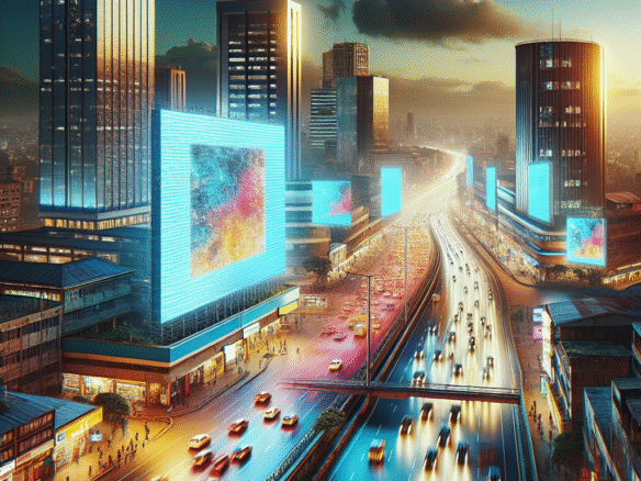
Mistake #8: Neglecting the Digital Transition
Embrace Digital Ad Innovations
With the rise of digital advertising Kenya, combining traditional billboard designs with digital elements can significantly enhance engagement. Ignoring digital trends may risk making your billboard feel outdated.
Example: A static billboard promoting an upcoming music festival in Kisumu can be boosted by incorporating QR codes linking to ticket sales, making it interactive.
Tip: Leverage technology by integrating AR elements or time-sensitive promotions that encourage interaction, ensuring your billboard stays relevant.
Mistake #9: Lacking Consistency with Brand Identity
Align with Your Brand
Billboards should reflect your brand’s identity and values. A disconnect between your billboard design and overall branding can confuse potential customers.
Insight: A high-end fashion brand featuring a casual look on their billboard may attract the wrong audience.
Tip: Ensure that colors, fonts, and images you use on billboards are consistent with your brand’s overall identity, facilitating brand recall.
Mistake #10: Not Testing Your Design
Feedback is Key
Finalizing a billboard design without testing can lead to unforeseen issues. What may look good on paper might not resonate with real-world audiences.
Example: A billboard in Nakuru featuring clever wordplay might not be understood by everyone.
Tip: Gather feedback from individuals who represent your target audience before launching your billboard. Test its impact by getting opinions on clarity, appeal, and relevance.
Key Takeaways for Advertisers and Brands
- Focus on simplicity: Prioritize clarity in messaging to maximize viewer retention.
- Prioritize legibility: Use fonts and colors that enhance readability from a distance.
- Incorporate localization: Tailor your messaging to the demographics of specific locations.
- Leverage high-quality visuals: Invest in professional photography to boost brand perception.
- Embrace digital opportunities: Stay ahead of trends by incorporating interactive elements into your designs.
- Ensure brand consistency: Align your billboard’s design with your broader brand identity for a unified image.
- Test before launching: Gather feedback on designs to improve effectiveness.
By avoiding these pitfalls, your billboard can become not just an advertisement, but a powerful tool for growth and visibility in the dynamic Kenyan marketplace. Embrace strategic design to ensure your brand stands tall amidst the bustling streets of Nairobi, Mombasa, and beyond.


Join The Discussion